15 Metal Barn Color Ideas for a Stylish Modern Look
Explore 15 metal barn color ideas that blend bold style with modern charm, plus simple tips for picking the perfect finish.
So you finally got the metal barn up, the panels are gleaming, and now comes the part that keeps you awake at night. What color do you paint the thing? It sounds like a small decision until you realize that color is the first handshake your property gives anyone who drives up. A barn can look like a forgotten equipment shed or like a design feature you brag about, and the difference usually comes down to a few shades on a swatch card. Think of your barn as a big canvas that happens to hold hay, horses, or your woodworking hobby. Ready to paint outside the lines a little? Here are fifteen color directions that feel fresh, modern, and honestly kind of fun to look at every single day.
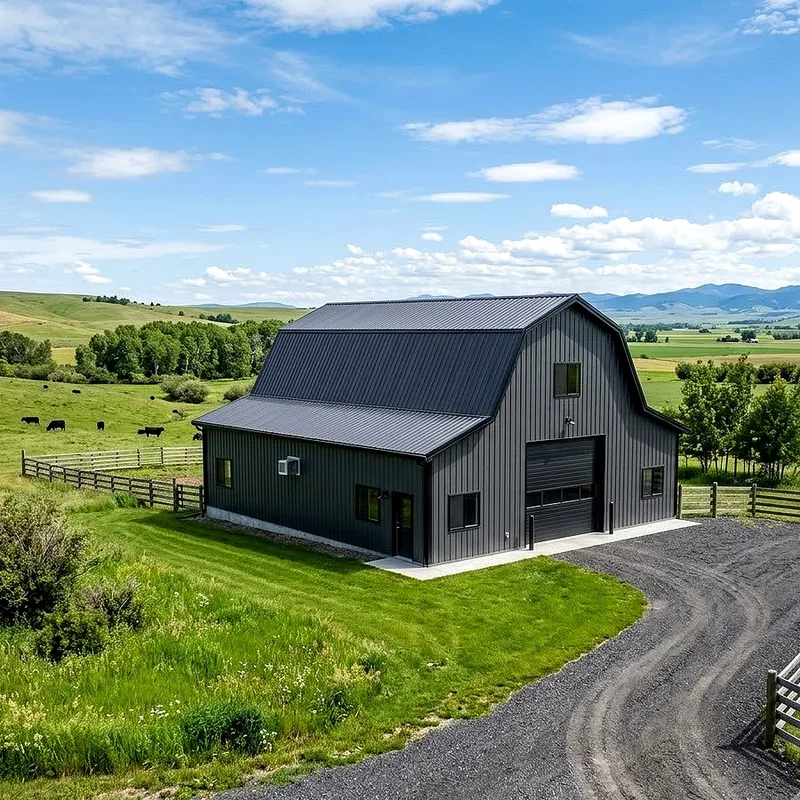
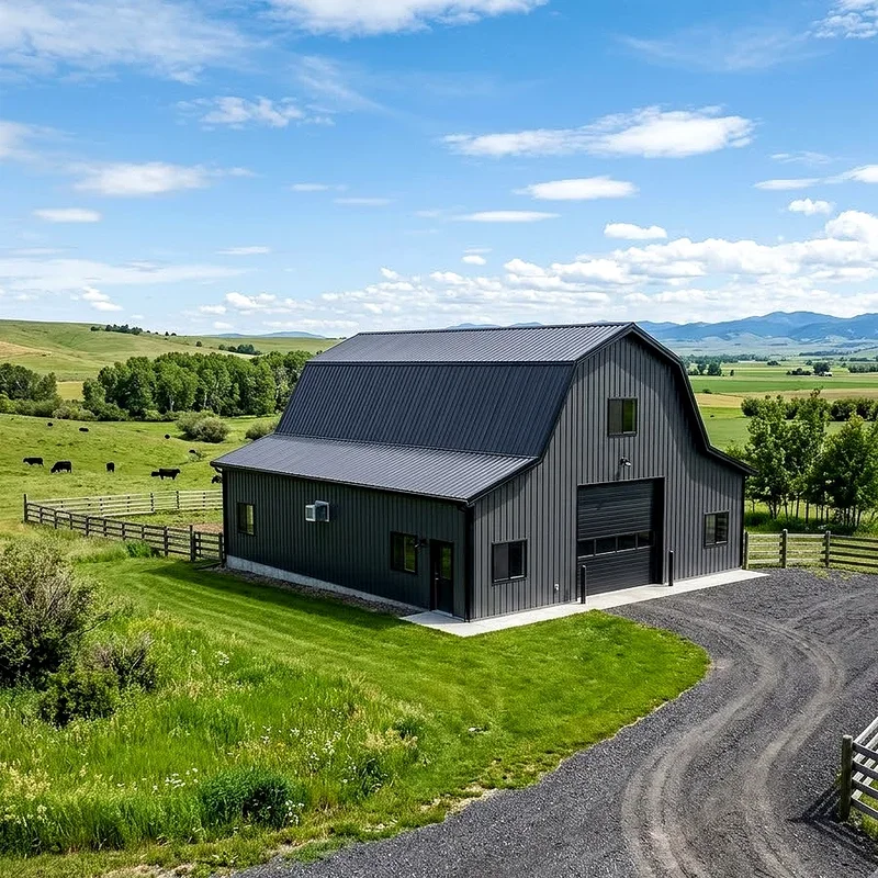
1. Classic Charcoal Gray
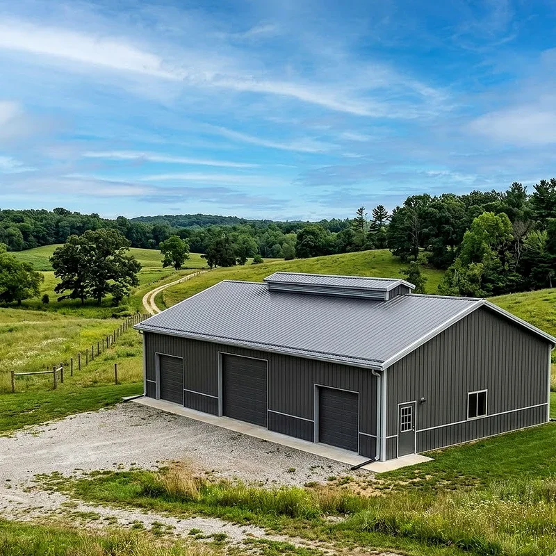
Charcoal gray is the little black dress of metal barn colors, and honestly, it never lets you down. It sits somewhere between soft and serious, so your building reads modern without shouting about it. Do you want something that hides dust, pollen, and the occasional mud splash from a tractor tire? Charcoal handles all of that quietly. It also plays beautifully with almost any trim you throw at it, whether that is bright white, warm cedar, or brushed silver. On a gray winter morning it looks moody and architectural, and under summer sun it picks up cool blue undertones you would never expect. If you feel nervous about committing to color, start right here. Charcoal gives you a confident foundation that still leaves room for fun doors, roofing, and accents later.
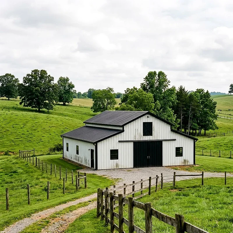
2. Crisp White With Dark Trim
White barns used to feel plain, like a blank page nobody bothered to fill. Not anymore. Pair a clean white body with black or charcoal trim and suddenly you have something that belongs in a design magazine. The contrast does all the heavy lifting, outlining your barn the way eyeliner sharpens an eye. White also bounces sunlight instead of soaking it up, which means the inside stays noticeably cooler during brutal July afternoons. Yes, you will wash it more often, and yes, red clay splash is a real enemy. But the payoff is a building that looks crisp against green pastures, golden fields, and gray winter skies alike. Want your barn to feel bigger than it actually is? White pulls off that illusion better than almost anything else.
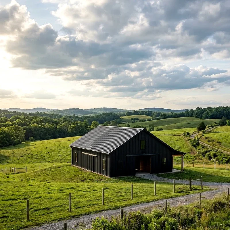
3. Matte Black for Drama
Some people see a black barn and immediately ask if you are running a distillery or a design studio. That reaction is the whole point. Matte black turns a simple metal structure into a sculptural object, the kind of shape that looks intentional from the road. It hides seams, fasteners, and minor dents like a magician hiding a card, so your barn stays looking sharp much longer. Pair it with pale wood doors or a hit of brass hardware and the effect goes from farm building to farmhouse cool in one step. Heat is the trade off, since dark panels absorb sun like a cast iron skillet. Good insulation and ridge ventilation solve most of that. Would you rather blend in or make people slow down as they pass?
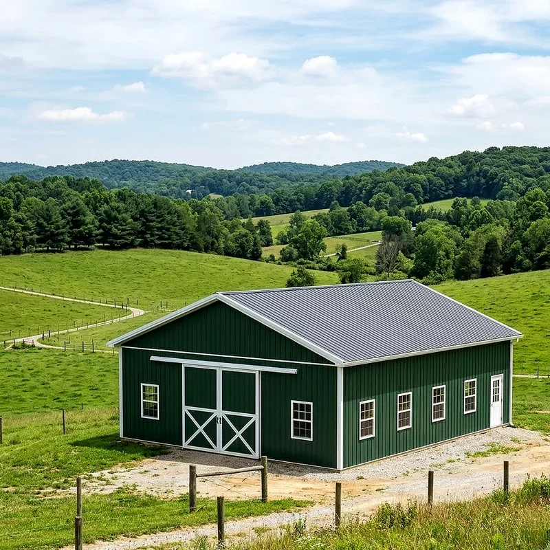
4. Deep Forest Green
Forest green is what happens when a barn decides to stop competing with nature and join it instead. Against tree lines, pastures, and mountain backdrops, this shade practically melts into the landscape while still looking deliberate and polished. It carries an old world feeling, a bit like a hunting lodge or a well loved cabin, yet it reads completely modern when you pair it with black trim and clean gutters. Green also hides pollen season better than lighter colors, which anyone living near pine trees will appreciate deeply. Seasons change around it and the barn simply adjusts, glowing against autumn orange and standing calm against February snow. If your property leans woodsy or rural, this color feels less like a choice and more like common sense.
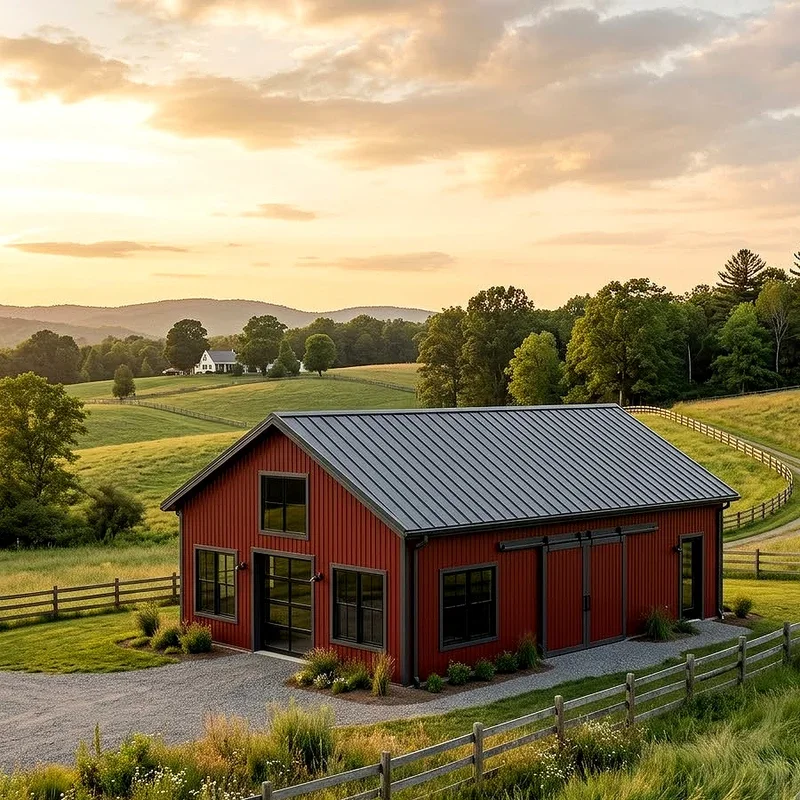
5. Barn Red, Reimagined
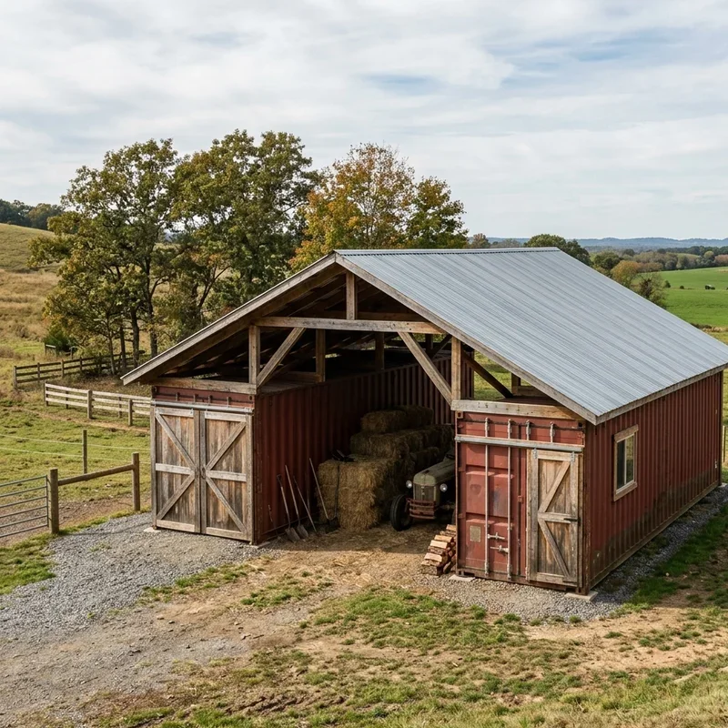
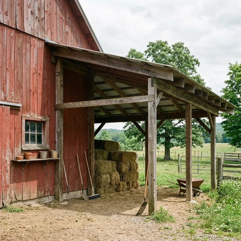
Traditional barn red has serious history behind it, but the modern version skips that bright fire engine tone in favor of something deeper and dustier. Think brick, wine, or weathered clay instead of candy apple. Suddenly the nostalgia stays but the cheapness disappears. Pair a muted red with charcoal roofing and white trim and the whole building feels curated rather than dated. Red also photographs beautifully, which matters more than people admit when your barn ends up in family photos, event listings, or property marketing. Does it work everywhere? Not quite. Red can fight with orange toned brick homes or busy landscaping. But set against green grass or snow, it hits like a warm sweater on a cold day. Classic, comforting, and quietly confident.
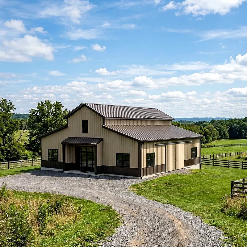
6. Sandstone Beige
Beige gets unfairly labeled as boring, which is a shame because sandstone tones do something no bold color can. They disappear politely. In dry climates, desert regions, or anywhere with sunbaked soil, this shade matches the ground so naturally that your barn feels rooted rather than dropped in. Sandstone also reflects a decent amount of heat, keeping interiors more comfortable than darker options. The real magic happens with trim. Add dark bronze, black, or deep brown edges and that soft body color turns warm and expensive looking instead of flat. Dust barely shows, which is a genuine gift if you live down a gravel road. Would you rather clean panels every weekend or spend that time actually using the barn? Sandstone quietly answers that question.
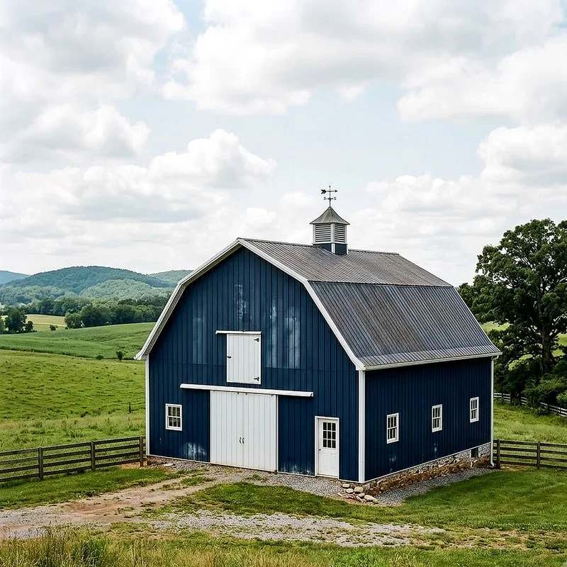
7. Navy Blue
Navy is the color people choose when they want something unexpected that still behaves itself. It carries the weight and seriousness of black but softens the edges, almost like a storm cloud with better manners. Against white trim it feels nautical and crisp, while paired with natural wood it turns cozy and grounded. Navy also looks stunning during golden hour, when late sun turns the panels into something closer to deep indigo. Because blue rarely appears on rural buildings, your barn instantly stands apart without feeling loud or gimmicky. Fading is worth thinking about, so choose a quality finish with strong UV protection. Is navy a little bolder than average? Sure. But bold in a quiet way is exactly what modern design keeps chasing lately.
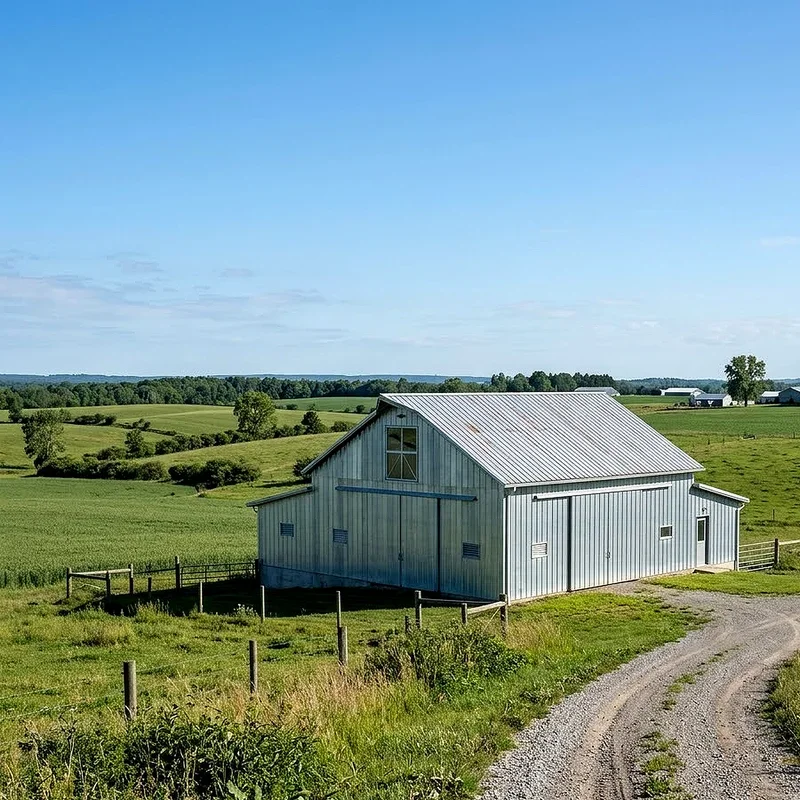
8. Galvanized Silver
Sometimes the smartest move is leaving the metal alone. Galvanized silver celebrates the material instead of covering it, and that honesty looks incredibly current right now. The surface shifts constantly, catching light in the morning and turning soft pewter under clouds, so the barn never looks quite the same twice. It also weathers gracefully, developing a patina that feels earned rather than neglected. Pair raw silver panels with black framing, timber accents, or a bright door color and the industrial vibe turns warm and livable. Maintenance stays refreshingly low since there is no paint layer waiting to chip or fade. Think of it like a well worn leather jacket. It simply gets better with age instead of demanding constant attention from you every season.
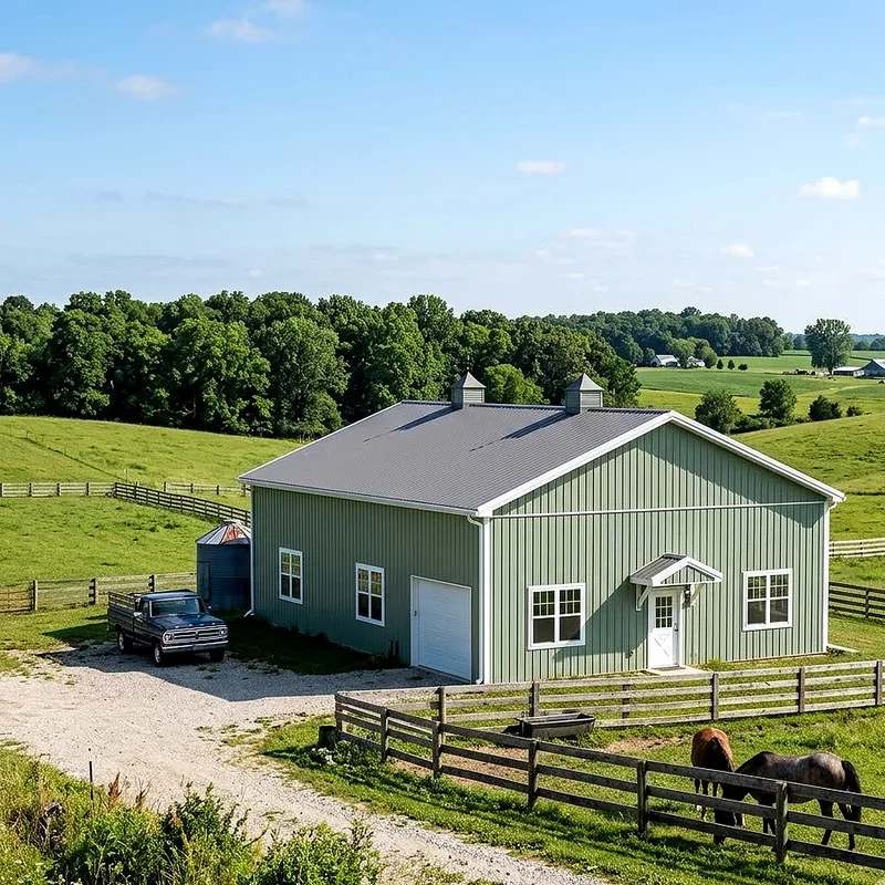
9. Soft Sage Green
Sage has quietly taken over interiors, and it turns out barns love it too. This muted green whispers instead of shouting, giving a building that calm, slightly vintage feeling without tipping into pastel territory. It pairs shockingly well with cream trim, black hardware, and natural stone foundations. Sage also flatters surrounding plants, making gardens and pastures look richer by comparison, a bit like how a neutral frame makes artwork pop. In sunlight it warms up toward olive, and in shade it cools toward gray, so you get variety from a single shade. If you plan to host events, run a small business, or simply want your property feeling peaceful, sage sets that mood immediately. Restful, timeless, and a little unexpected in the best way.
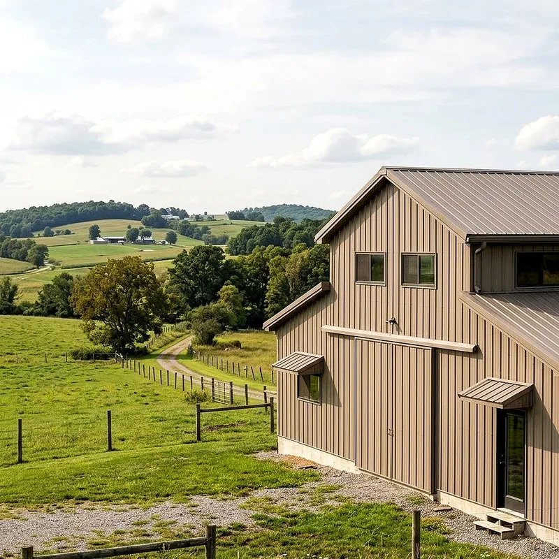
10. Warm Taupe
Taupe lives in that sweet spot between brown and gray where nothing ever clashes. It is the diplomat of the color world, getting along with brick homes, stone walkways, cedar fencing, and green landscaping all at once. For anyone building near an existing house, that flexibility matters enormously. Taupe keeps the barn visually connected to everything else instead of competing for attention. Add darker brown or black trim and the whole structure gains definition, almost like adding a belt to a loose coat. Dirt and dust blend in easily, which cuts your cleaning schedule down considerably. Is it exciting? Maybe not on a swatch card. On an actual building, surrounded by real light and real landscape, taupe looks remarkably warm and expensive every single day.
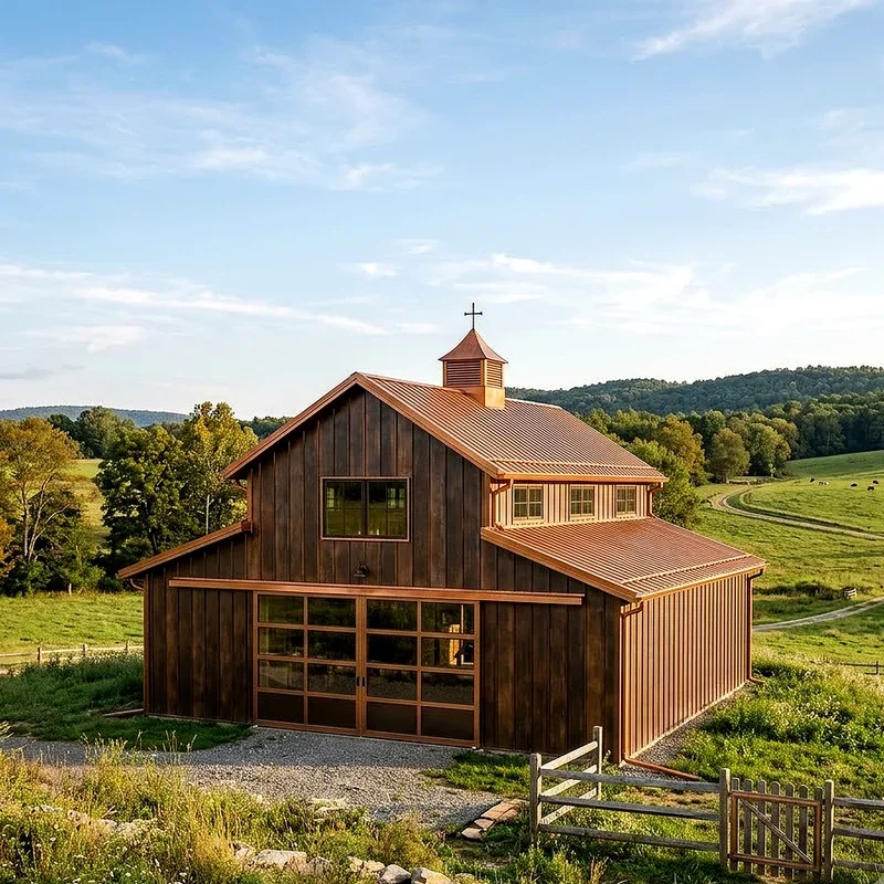
11. Burnished Bronze and Copper Tones
Bronze brings something rare to metal buildings, a sense of richness that flat colors simply cannot fake. These warm metallic tones shift constantly, glowing amber at sunset and settling into deep brown at midday. The effect feels architectural, like the barn belongs beside a modern winery or a design forward ranch house. Copper tones do something similar, adding a hint of luxury without turning gaudy. Pair either finish with black framing and large glass doors for a look that stops conversations. Because the color already carries so much depth, keep landscaping simple and let the panels do the talking. Ever notice how one great accent makes an entire outfit work? That is exactly what bronze does for a metal barn.
12. Slate Blue
Slate blue is gray that went on vacation and came back more interesting. It holds enough blue to feel intentional but enough gray to stay grounded, which makes it wonderfully easy to live with long term. Against white trim it looks coastal, against black it looks contemporary, and against wood it looks almost Scandinavian. This shade also handles weather beautifully, since faded spots and water marks blend into the natural variation of the color. If you have ever worried about choosing something you will regret in five years, slate blue offers real insurance. It feels current without chasing a trend that expires next season. Calm, adaptable, and surprisingly photogenic, especially on those overcast days when brighter colors tend to look washed out.
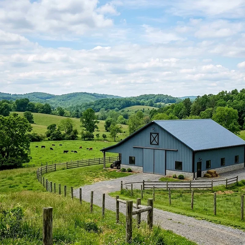
13. Cream and Black Two Tone
Two tone designs solve a problem most people do not notice until it is too late. Large metal buildings can look like giant blank boxes. Splitting the exterior fixes that instantly. Try cream on the upper portion with black wainscoting along the bottom four feet, and suddenly the barn has proportion, structure, and a sense of scale. The dark lower band also takes the abuse from mud, mowers, and splashing rain, hiding wear where it actually happens. Cream keeps everything feeling soft and welcoming rather than stark, especially when morning light hits it. Add black trim around doors and windows to tie the whole thing together. It is a simple trick, but good design usually is, right?
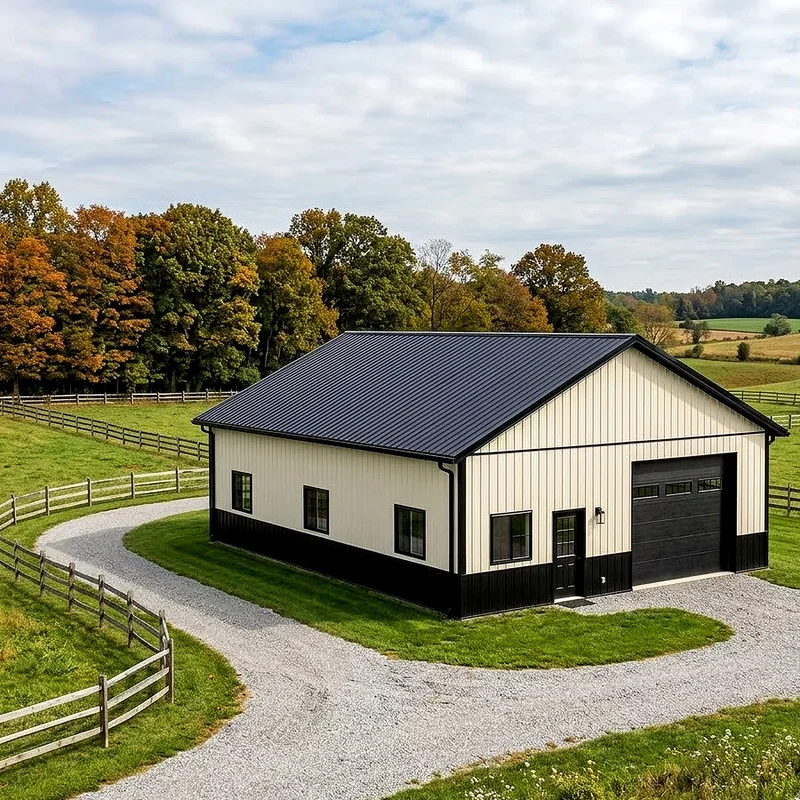
14. Rich Chocolate Brown
Chocolate brown feels like the color equivalent of a strong cup of coffee, deep and satisfying without any fuss. It works especially well on properties with mature trees, timber accents, or stone features, blending into that natural palette effortlessly. Brown also forgives a lot, hiding dirt, pollen, and the general chaos of daily farm life better than nearly anything else. Pair it with tan or cream trim for warmth, or go with black trim for a sharper modern edge. Because brown reads as neutral, you can change doors, roofing, and landscaping later without repainting the entire structure. Think of it as the dependable friend who never causes drama. Quiet, grounded, and genuinely handsome once the surrounding landscape fills in around it.
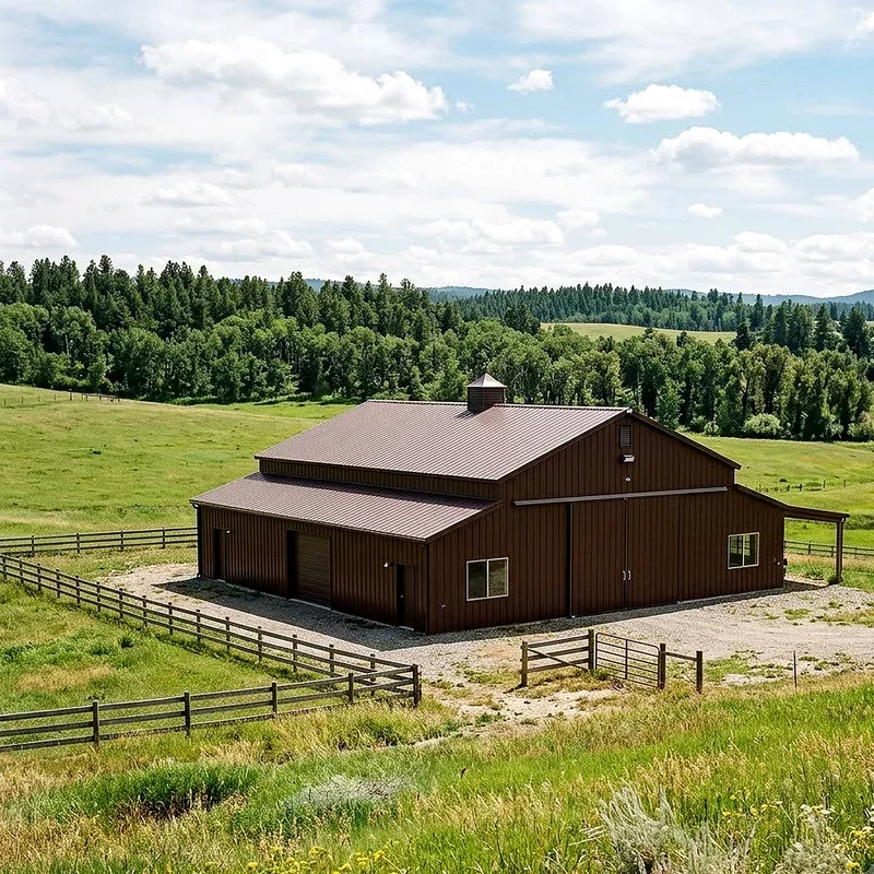
15. Bold Terracotta
Terracotta is for people who looked at every neutral option and thought, no thanks. This earthy orange red carries Mediterranean warmth and southwestern confidence at once, turning a plain metal barn into something with real personality. It glows almost golden at sunset and stays rich even under gray skies. Balance matters here, so keep trim simple with cream, sand, or deep brown and let the body color lead. Terracotta also pairs beautifully with gravel drives, desert plants, and clay tile roofing on nearby buildings. Worried it might feel like too much? Choose a slightly dusty version rather than a bright one and the whole thing calms right down. Some barns blend in. This one shows up and owns the view.
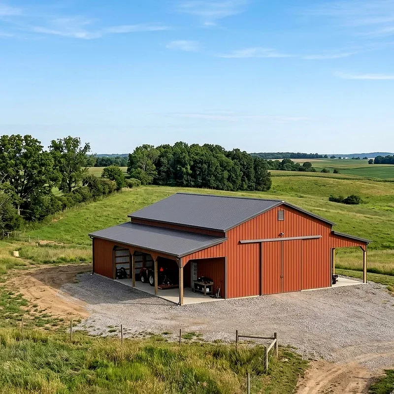
Conclusion
Choosing a barn color really comes down to two questions. What does your landscape already look like, and how loud do you want to be about it? Neutrals like charcoal, taupe, and sandstone keep things effortless, while navy, terracotta, and matte black make a statement you will notice every time you pull in the driveway. There is no wrong answer here, only the one that suits your property and your personality. Grab a few samples, tape them to the panels, and watch how they shift through a full day.
Frequently Asked Questions
Q1: Which metal barn color stays coolest in hot summer weather?
A: Light colors like white, cream, and sandstone reflect sunlight best, keeping interior temperatures noticeably lower.
Q2: Do dark barn colors fade faster than lighter ones?
A: Yes, dark shades fade sooner, so choose finishes with strong UV resistant coatings and warranties.
Q3: Should barn trim match the house or contrast it?
A: Contrast usually looks sharper, but matching trim works well when buildings sit closely together.
Q4: Is two tone painting worth the extra cost?
A: Absolutely, since it adds visual proportion and protects lower panels from mud and splashing.
Q5: How often should metal barn panels be repainted?
A: Quality factory finishes typically last twenty years or longer before any repainting becomes necessary.
Stay up to date with our latest ideas!